В этой статья я хочу поделиться опытом использования open source систем Zabbix и Grafana для визуализации работы производственных линий. Информация может быть полезна тем, кто ищет быстрый способ визуального отображения или аналитики собранных данных в проектах промышленной автоматизации или IoT. Статья не является подробным руководством, это скорее концепция системы мониторинга, основанная на открытом программном обеспечении для производственного предприятия.
- Инструментарий
- Собираем все вместе
- Создаем Dashboard
- Получение данных
- Преобразование данных
- Теперь про саму визуализацию
- Результат
- Заключение
- Table of contents
- Goals for all your dashboards
- Spinning up a Grafana playground in a minute
- Getting started with a playground dashboard
- High-level dashboard creation guidelines
- Choose main input for the high-level dashboard
- Metric naming and cardinality
- Stat instead of Graph for human understanding within milliseconds
- Keep panels small on screen
- Avoid dropdowns for variable values
- Dashboards-as-code and GitOps (committed dashboards)
- Dashboard generation from jsonnet code using the grafonnet library
- Fast develop-deploy-view cycle
- Automatic provisioning of generated dashboards into Grafana instance
- Jsonnet for dashboards — some tips
- Distinguish environments
- Consider jsonnet as full programming language
Инструментарий
Zabbix – его мы используем давно для мониторинга ИТ инфраструктуры завода. Система оказалось настолько удобной и универсальной, что мы стали заводить в нее данные с производственных линий, датчиков и контроллеров. Это нам позволило собрать все данные метрик в одном месте, сделать простые графики расхода ресурсов и производительности оборудования, но очень не хватало аналитики и красивых графиков.
Grafana – это мощнейший инструмент для аналитики и визуализации данных. Большое количество плагинов позволяют забирать данные из различных источников (zabbix, clickhouse, influxDB), обрабатывать их на лету (считать среднее значение, сумму, разницу и т.д.) и рисовать всевозможные графики (от простых линий, спидометров, таблиц до сложных схем).
Draw.io – сервис, позволяющий в онлайн редакторе нарисовать от простой блок схемы до плана помещений. Есть много готовых шаблонов и нарисованных объектов. Данные можно экспортировать во все основные графические форматы или xml.
Собираем все вместе
Статей как установить и настроить Grafana и Zabbix написано много, я расскажу про основные моменты конфигурации.
На Zabbix сервере создается «узел сети» (host), которому будут принадлежать «элементы данных» (item) с метриками от наших датчиков. Имена узлов и элементов данных желательно продумать заранее и сделать максимально структурированными, так как к ним мы будем обращаться из графаны через регулярные выражения. Такой подход удобен тем, что можно одним запросом получать данные с группы элементов.
Для настройки графаны потребуется установить дополнительные плагины:
- Zabbix by Alexander Zobnin (alexanderzobnin-zabbix-app) – интеграция с zabbix
- natel-discrete-panel – плагин для дискретной визуализации на горизонтальном графике
- pierosavi-imageit-panel – плагин для отображения данных поверх своей картинки
- agenty-flowcharting-panel – плагин для динамической визуализации схемы из draw.io
Создаем Dashboard
Вот тут начинается та самая магия графаны и ее плагинов.
Плагин natel-discrete-panel
У нас есть данные о статусах двигателей на линиях (работает = 1, не работает =0). При помощи графика discrete мы можем нарисовать шкалу, на которой будет видно: статус двигателя, сколько он проработал минутах/часах или % и как часто запускался.

Визуализация статусов двигателей
На мой взгляд, это один из лучших графиков для визуализации производительности оборудования. Сразу видно сколько времени оно простаивает, в каких режимах работает чаще. Данных может быть много, есть возможность их агрегации по диапазонам, преобразование по значениям (если значение «1», то отображать как «ON»)
Imageit удобно использовать когда у вас уже есть нарисованная схема или план помещения, на которую вы хотите нанести данные с датчиков. В настройках визуализации нужно указать url адрес к картинке и добавить нужные вам элементы sensor. Элемент появляется на картинке и его можно разместить в нужном месте мышкой.

Схема печи с метриками температуры и давления
Про создание визуализации FlowCharting я хотел бы рассказать более подробно, так как это невероятно функциональный инструмент. Он позволяет сделать динамическую мнемосхему, элементы которой будут реагировать на значения метрик (менять цвет, положение, название итд).
Получение данных

Пример настройки запроса данных о двигателях первой линии и наличии сырья
Преобразование данных
Исходные данные могут быть не всегда в том виде, в котором нам нужно их отобразить. Например, у нас есть ежеминутные данные о весе продукта в емкости (кг), и нам нужно отобразить скорость заполнения в т/час. Я это делаю следующим образом: беру данные о весе и преобразую их функцией графаны delta, которая считает разницу между значениями метрики, так текущий вес превращается в кг/мин. Затем умножаю на 0.06 для приведения результата в тонны/час. Так как метрика веса используется в нескольких запросах, я указываю для нее новый псевдоним (setAlias) и буду его использовать в правиле визуализации.

Пример использования параметра delta и множителя и переименования метрики в запросе
Вот еще пример преобразования данных: мне нужно было подсчитать кол-ва замесов (начало цикла = пуск двигателя). Метрика считается на основе статуса двигателя «линия 1 — насос откачки из бака 1 (статус)». Преобразование: данные исходной метрики меняем функцией delta (разница значений), таким образом в метрике будет значение «+1» для пуска двигателя, «-1» для остановки и «0» когда двигатель не меняет свой статус. Затем убираю все значения меньше 1 и суммирую их. В результате получается кол-во пусков двигателя.

Пример преобразования данных из текущего статуса в кол-во пусков
Теперь про саму визуализацию
В настройках отображения есть кнопка «Edit Draw», она запускает редактор, в котором можно нарисовать схему. У каждого объекта на схеме есть свои параметры. Например, если указать настройки шрифта в редакторе – они будут применяться к визуализации данных в графане.

Так выглядит редактор в Draw.io
После сохранения схемы, она появится в графане и можно будет создавать правила изменения элементов.
В параметрах () мы указываем:
- Options — задается имя правила (Rule name), название или псевдоним метрики, данные которой будут использоваться (Apply to metrics). Тип агрегации данных (Aggregation) влияет на конечный результат метрики, так Last — означает, что будет выбрано последнее значение, avg — среднее значение за период, выбранный в верхнем правом углу.
- Thresholds — параметр пороговых значений, описывает логику применения цвета, то есть выбранный цвет будет применяться к элементам на схеме в зависимости от данных метрики. В моем примере при значении метрик «0» — статус «Ok» цвет будет зеленый, при значении «>1» статус Critical и цвет будет красный.
- Color/Tooltip Mappings» и «Label/Text Mappings» — выбор элемента схемы и сценария его поведения. В первом сценарии объект будет закрашен, во втором – на нем будет текст с данными из метрики. Для выбора объекта на схеме нужно нажать знак цепи и кликнуть мышкой на схеме.

На этом примере я закрашиваю насос и его стрелку красным цветом если он работает и зеленым если нет
При помощи плагина flowcharting мне удалось нарисовать схему всей линии, на которой:
- меняется цвет агрегатов в соответствии с их статусом
- есть сигнализация отсутствия продукта в емкостях
- отображается настройка частот двигателей
- скорость заполнения/сброса первого бака
- подсчитывается кол-во циклов работы линии (замесы)

Визуализация работы производственной линии
Результат
Самым сложным для меня было получить данные с контроллеров. Благодаря универсальности заббикса в плане получения данных и гибкости графаны за счет плагинов, потребовалось всего пара дней для создания комплексного экрана мониторинга производственной линии. Визуализация дала возможность просмотра графиков и статистики состояний, плюс легкий доступ через веб всем заинтересованным – все это позволило быстро выявлять узкие места и неэффективное использование агрегатов.
Заключение
Мне очень понравилась связка Zabbix+Grafana и я рекомендую обратить на нее внимание, если вам нужно быстро обработать данные с контроллеров или датчиков без программирования или внедрения сложных коммерческих продуктов. Безусловно, это не заменит профессиональные SCADA системы, но будет достаточно как инструмент централизованного мониторинга всего производства.
April 21, 2022
Grafana is a web-based visualization tool for observability, and also part of a whole stack of related technologies, all based on open source. You can configure various data sources — time series sources like Prometheus, databases, cloud providers, Loki, Tempo, Jaeger — and use or even combine them for your observability needs. As of April 2022, that means metrics, logs, traces, and visualizations based on those concepts. That is where dashboards come into play.
Dashboards are the typical first solution that even small companies or hobbyists can use to quickly get insights of their running software, infrastructure, network, and other data-generating things such as edge devices. In case of incidents, or for just glancing over them at will, dashboards are supposed to give a good overview to find and solve problems. Great dashboards make the difference of understanding an incident in 10 seconds vs. digging into red herrings for over 5 minutes. Meaningful dashboards also ease the path to setting correct alerts that do not wake you up unnecessarily.
On top of dashboards, you can leverage alerts, logs and tracing which together form a simple and helpful look at your stuff, if done right — or a complicated mess like your legacy software code, if done wrong 😏. Those other concepts are out of scope in this article. I only focus on how to achieve helpful, up-to-date dashboards, using private research and my production experience, where I extensively used Grafana dashboards — and also logs — to resolve incidents fast, and often with ease.
Typical examples on the internet present dashboards as a huge screen full of graphs, sometimes a collection of numbers or percentages. A lot to look at for human eyes. I will show you how to visualize better, with realistic examples. This article showcases solutions for Grafana and Prometheus, but can also be applied generically for other platforms.
Table of contents
- Goals for all your dashboards
- Spinning up a Grafana playground in a minute
- Getting started with a playground dashboard
- High-level dashboard creation guidelines
- Choose main input for the high-level dashboard
- Metric naming and cardinality
- Stat instead of Graph for human understanding within milliseconds
- Keep panels small on screen
- Avoid dropdowns for variable values
- Dashboards-as-code and GitOps (committed dashboards)
- Dashboard generation from jsonnet code using the grafonnet library
- Fast develop-deploy-view cycle
- Automatic provisioning of generated dashboards into Grafana instance
- jsonnet for dashboards — some tips
- Distinguish environments
- Consider jsonnet as full programming language
- Grafana-specific dashboard tips
- Categorize, do not make a dashboard mess
- Grouping within a dashboard
- Make dashboards editable
- Tooltip sort order
- Y axis display range
- Link to detailed dashboards, logs, other observability tools
- Use variables for repetitive values
- Clearly differentiate environments
- Grid positioning
- Choose the right data unit
- UTC timezone everywhere
- Do not rely on
defaultdata source - Heatmaps
- Display interesting events as annotations
- Self-describing visualization titles
- Observability tips not specific to Grafana
- Stay consistent in naming metrics and labels
- No need to create a metric for everything / how to easily get started monitoring an uninstrumented application
- Show only offenders or top N problematic items
- Mind test and synthetic traffic
- Daytime vs. nighttime
- Do not use
rate(…)alone - Prefer counters over gauges
- Make observed components distinguishable
- Summary
- Out of scope
- Related reading
Goals for all your dashboards
You cannot look only at best practices for a single dashboard. If you do that, you will end up with 100 dashboards, each for a single, distinct purpose, such as one per microservice. But altogether, that becomes an unmanageable mess.
Fast resolution of incidents, by finding the root cause and impacted services/customers fast
Show health at a glance, with a simple indicator that the human eyes can quickly consume (e.g. green or red background color), for each component
Allow drilling down into more detail (low-level) in order to come closer to the root cause if the high-level dashboard is not enough
How this can roughly work:
Create a high-level overview dashboard. It depends on your company how many of those make sense. The scope could be one system, service, product domain, or for small companies even the whole landscape at once.
Represent each component or microservice of a system in the high-level overview
For fine-grained analysis, it also often makes sense to create a separate, detailed (low-level) dashboard for each component. The high-level dashboard links to those.
From each visualization (those are the rectangles on your dashboard, such as graphs), link to detailed dashboards, prepared log queries, debugging tools on your intranet, the system/website itself, etc.
For medium to large companies in terms of head count, introducing such a consistent concept will be impossible unless technical leadership supports the full switch from the old or non-existing monitoring solution to Grafana with dashboards-as-code. It is key to document and communicate that codifying dashboards is the only way to go, listing the rationale for your company and also how a developer can start creating or modifying dashboards. This requires no more than one-page documentation/guide and an introduction by leadership or engineering managers.
Spinning up a Grafana playground in a minute
Some solutions exist — most of them using docker-compose — which allow you to easily and quickly spin up Grafana and data sources in a minute. Here, I describe the official devenv that Grafana developers and contributors use (see Grafana’s devenv README):
git clone --depth 1 https://github.com/grafana/grafana.git
cd grafana/devenv
# As of 2022-04, these are the instructions.
# Check `README.md` files for more information.
./setup.sh
cd ..
# See directory `devenv/docker/blocks` for more supported sources.
# "grafana" is not a source - this value ensures you don't have to
# build Grafana, and an official image is used instead.
make devenv sources=grafana,loki,prometheus
# To tear down later: `make devenv-down`
Getting started with a playground dashboard
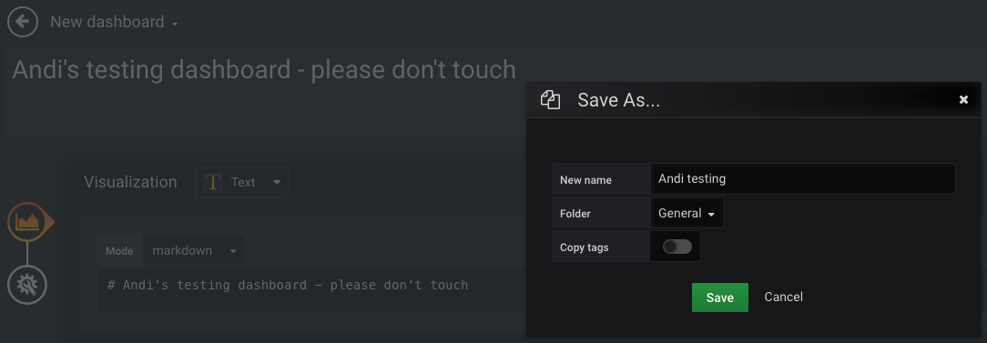
Mind that a good dashboard takes hours or days to create! As a start, the graphical way of clicking one together is the fastest. Once you have found out a good concept and layout, codifying it for the first time is some work, but worth the effort — more on that later.
High-level dashboard creation guidelines
Choose main input for the high-level dashboard
By first concentrating on monitoring and alerting for the main function of your business and system, you can cover almost all critical problems in subcomponents and infrastructure resources, without having to monitor those explicitly.
Admittedly, that will not cover if the internet, a customer, or our API are down, because payment requests would not even reach the system and therefore cannot produce logs or error metrics. That can be covered by a metric describing the payment request rate, probably by customer and payment method, since each of those have different typical traffic rates (minimum/maximum, different per timezone or day/night, etc.). We keep this shortcoming out of scope to keep the blog article simple. The point is: choose very few, essential business metrics as a start, not technical metrics.
Often, you would select the most business-relevant Prometheus metric offered by the system you want to monitor. Metrics are stored as time series and therefore very fast to query, as opposed to logs. If you use other observability tools, such as an ELK stack, you can check if Grafana supports the relevant data source. This metric would typically pertain to the methods «RED» (requests/rate, errors, duration) or «USE» (utilization, saturation, errors). The Four Golden Signals of Google’s SRE book additionally distinguishes traffic from saturation. An error metric is a good choice to start, since it is easy to determine which error rate is acceptable, and at which threshold you would consider it a serious problem.
Imagine we are in a company that processes payments, offering different payment methods, with each of those methods (e.g. credit card, voucher, bank transfer) having a separate microservice implementation
Cardinality — the counter has these labels:
payment_method(example valuescredit_card,voucher,bank_transfer)error_type(example valuesconnectivity_through_internet,remote_service_down,local_configuration_error)
Metric naming and cardinality
We do not want to have separate metrics credit_card_payment_errors_total and bank_transfer_payment_errors_total! If you have microservices of the same type, as in this example one service per payment method, the metrics really mean the same thing. So rather improve your consistency and use just one metric name. Easy to do if your code is structured in a monorepo, by the way. If you have inconsistent names, it will take extra effort to repeat each dashboard visualization for each of the conventions, instead of just using labels to distinguish and plot the services (or other traits that you define as label dimensions, such as customers).
Avoid high-cardinality metrics (many label combinations), since those take up lots of space, and queries take longer. Like for the logging rate of your systems, you might want to check for large metrics sporadically, or you may run into unnecessary cost and performance issues.
Stat instead of Graph for human understanding within milliseconds
A graph (nowadays called Time series visualization) for our example metric, showing payment method and error type combinations, looks like this:
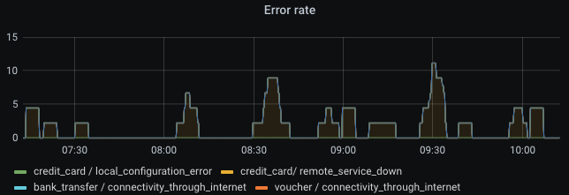
Cool graph, right? And we’re already done and have a monitored system! No, this is very, very bad! Great observability requires much more than just clicking together some visuals. The example is not sufficient to monitor a service. A graph visualization is a bad way to get an impression within milliseconds. The eyes have to scan the whole rendered graph, potentially containing multiple lines on varying bounds of the Y axis. You also need to know which thresholds are bad, or configure horizontal lines on the graph which represent warning and errors thresholds. That means lots of lines, colors, and points to look at before getting your question answered: «is this normal or do we have a problem, and where?»
Graphs can be helpful if you set them up nicely, but definitely not in the high-level part of your overview dashboard.
Instead, a Stat visualization, combined with traffic light colors, gives you the answer in milliseconds: green is good, amber (yellow) is noteworthy, red is bad. In addition, I tend to use blue as «noteworthy but may not be problematic» — kind of an early warning sign or unusually high amount of traffic, such as during sales/promotion seasons. So for me personally, I like the order green-blue-amber-red. Grafana allows choosing to color the background instead of the value line, which I recommend since then your whole screen should look green most of the time (click Panel > Display > Color mode > Background), and your eyes do not need to focus on the color of tiny graph lines. Exactly one value is shown — typically a number or human description.
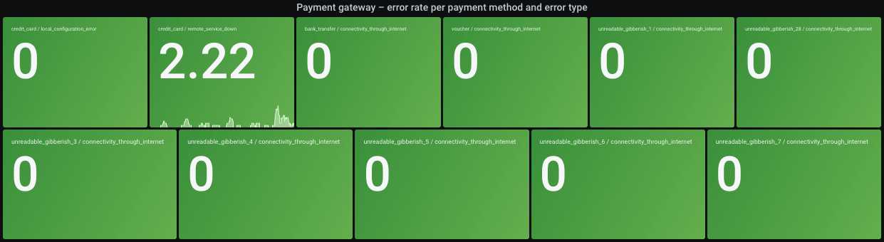
Settings for the above screenshot:
To show the colors, you need to set thresholds on the Field tab. Setting them as static numbers (with the queried unit, e.g. «errors per 2 minutes») may work for the start. That is called Absolute in Grafana.
In our example though, the different payment methods and error types have very different thresholds: for instance, let’s say the credit_card payment method has remote_service_down errors very frequently because the 3rd party provider is unreliable and we cannot help it, so we want to set a higher threshold because it otherwise unnecessarily shows a problem. Or instead of a higher threshold, you could consider querying the error rate increment over 10 minutes, to even out any short spikes. To use relative thresholds, click Percentage and fill some values. They will use the Min/Max settings. For example: if you set Min = 0 and Max = 200, red background color above the 66% threshold will be shown above 66% * 200 = 132 (unit in this example: errors within 2 minutes). Everything above 66% will be red. Everything between 16% and 33% will be blue. And so on.
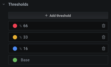
To set specific thresholds per value combination (here: «payment method / error type»), adjust Max:
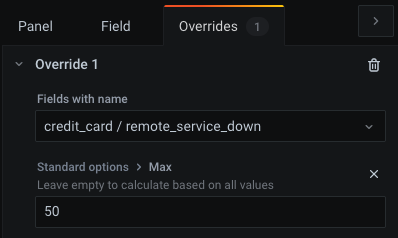
Example: our query shows the number of errors in 2 minutes. By looking at the graphed data of the last few days (paste query into Explore mode), we might find that 20 errors in 2 minutes are acceptable and should be shown as green. We therefore choose a slightly higher threshold of 25 to still be within the green color. Since we switch to blue color from 16%, we get Max = 25 * 100% / 16% = 156. As a result, red background color — which shouts «something is seriously wrong» — would be shown above Max * 66% = 103 errors in 2 minutes. You should experiment a little so that in healthy times, your dashboard remains green.
Side note: for «higher is better» metrics such as customer conversion rate (100% = all customer purchases succeed), you can just turn around the colors (green on top, red on bottom). The Max setting also defines the upper bound of the graph which is shown as part of the Stat visualization, so if values are higher, the line will cross the top of the Y axis and therefore becomes invisible. Not a big deal if Min/Max cover the expected range. You may also have the rare case of «too high and too low are both bad» metrics, e.g. a counter for payment requests where you always expect some traffic to be made, but also want to be warned if the request rate is soaring. The colors could be adapted to show both low range and high range as red, with green for the expected, normal range.
Keep panels small on screen
Pack only few visualizations horizontally, so the font stays large enough. Other people may work on a smaller screen than yours, or do not use full screen sizing. The repeat feature (Panel > Repeat options) makes Grafana create and align them automatically. In our example, the repeat feature is unused, but since we pulled different combinations of payment method and error type out of our (single, consistently named and labeled) metric, that will also show multiple rectangles in one Stat visualization, and try to align them on screen. In the screenshot further above, the titles are barely readable, and the visualization is large and could require scrolling on small screens. To solve that, you could:
Keep as-is and show a separate rectangle for each combination. With each added or newly monitored product/feature (here: payment methods), the whole dashboard size grows, so the page does not always look the same or fit on one screen. I’m not telling you it should fit on one screen, but a high-level dashboard must not be an endless scrolling experience.
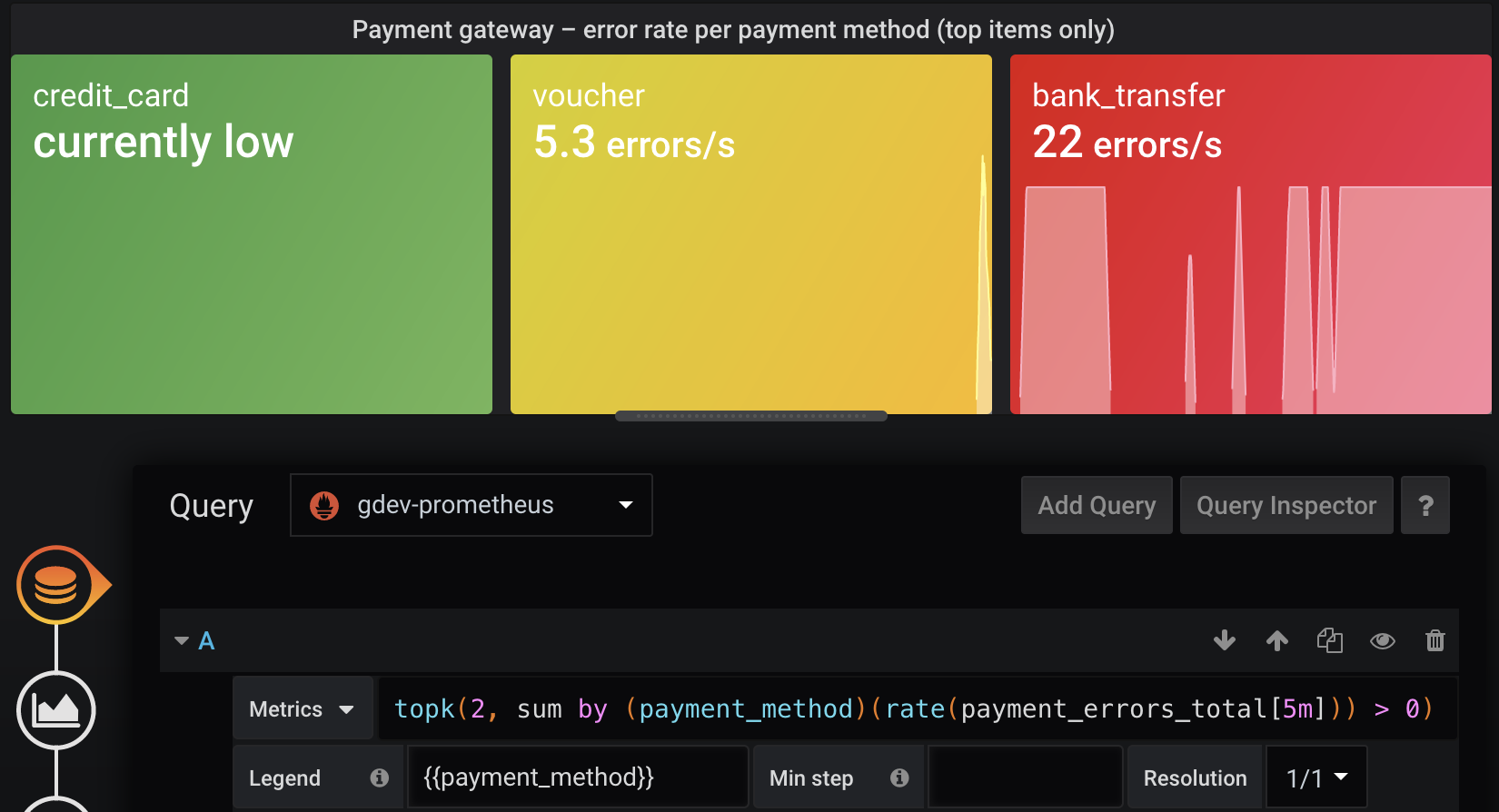
Show the top 10 highest error rates (Prometheus:
topk). This can be combined with traffic light coloring. If only one shows red, you will think that one payment method is down, while if multiple show red, you may think of a larger issue. With this solution, the visualization will never show as empty, so you’ll see ~10 green rectangles in healthy scenarios (the section Show only offenders or top N problematic items later explains why it won’t be exactly 10 🫣 — ping me if you find a solution). Compared to the above option, this ensures that the visualization remains at the same size and does not jump around on the web page, and you know that the dashboard is still working. Just like software, dashboards can become buggy and not show you the right things, for example if someone renames a metric!
Avoid dropdowns for variable values

Dashboards-as-code and GitOps (committed dashboards)
The Grafana provisioning documentation describes how to use a local directory which Grafana will watch and load dashboards from. However, you cannot just write dashboards as plain JSON as a human. Also, more ergonomic ways of importing dashboards, e.g. from a Git repo, are not supported yet but Grafana Labs is considering improvements.
Here is the rough plan:
Generate Grafana-compatible JSON containing dashboard objects. The Grafonnet library is the official way to develop dashboards using the Jsonnet language. There is also Weaveworks’ grafanalib for Python which is not presented in this article.
Add that build to CI. Deployment means that you have to make the JSON files available to Grafana in some directory.
Configure Grafana to pick up files from that directory
Also, support a developer workflow
Advantages of not creating dashboards visually through the Grafana UI:
You get a developer workflow. The later section Fast develop-deploy-view cycle explains how that works. It is surely worse than WYSIWYG. But a programming language such as jsonnet makes the repetitive parts so much more expressive and consistent. With file watching tools and a Grafana API key, you can deploy each saved change within a second and only need to reload in your browser. Very soon, it will be a great experience, once you have assembled some basic functionality and learned the language. While jsonnet is not the best or most well-known language, better alternatives such as CDK integration or other libraries may arise in the future. And once you have developed a dashboard, it is easy to improve in small increments, similar to software code. In fact, just like the main parts of your software code, dashboard code will typically be written once and then not touched for a long time. Codifying dashboards therefore leads to long-term consistency, yet making large changes easy. If you tell people to visually create dashboards instead of dashboard-as-code, after a few months you will see a bloat of outdated, awful, non-informative and unreviewed dashboards, with lots of them probably unused. Coded dashboards improve quality and allow you to throw out old stuff easily and with the needed 4-eye principle. You can still allow people to visually author dashboards, but tell them they will be automatically destroyed every Deleteday. Changes can be tested visually (at best with production data!) but should then be ported back into code. Once coded, a dashboard should go through review, and it is very likely that most changes reuse homegrown jsonnet functions instead of reinventing each dashboard from scratch. Simple improvements should become one-line changes. Reviewed dashboards are much more robust, stable and avoid outdated parts.
Consistent annotations such as deployment events, for instance by reusing a custom function which adds them everywhere
With such a custom base library of functionality, nobody needs to be an expert to get started making changes to monitoring
Vendor lock-in can be avoided to some extent. The Grafonnet library and custom object properties are highly Grafana-specific. No way around that. Even if you use WYSIWYG editing and storage, the dashboard is stored as Grafana-specific JSON, not transferable at all to other providers. I recommend to choose one observability platform and stick with it for years — just like you would for an infrastructure platform such as Kubernetes and its ecosystem. This article shows you how to cleanly manage your dashboards as code. That way, improving or fixing all dashboards at once is done within minutes, and you get the benefit of code review. If you write some high-level jsonnet functions such as
addDashboard(prometheusQuery, yellowThreshold, redThreshold)(pseudocode), you can even abstract Grafana-specific stuff to some extent and later port more easily once the company switches to another observability provider or cloud product. I cannot provide experience or examples (yet) whether such an abstraction layer is worth the effort.Old and unused stuff is easy to detect and delete. For example, you can
grepfor metric names or other things that do not exist anymore in your software, and delete those dashboards or visualizations from the code. Likewise, it is easy for a developer to find out where and if a metric is actually used for monitoring.
Dashboard generation from jsonnet code using the grafonnet library
Let’s set up the generation of our dashboard from code. First, the necessary tools. jb (jsonnet-bundler) will be used as jsonnet package manager, and go-jsonnet (not the much slower C++ implementation!) for the language itself.
# macOS + Homebrew
brew install go-jsonnet jsonnet-bundler
# Any other OS / package manager combination
go install -a github.com/jsonnet-bundler/jsonnet-bundler/cmd/jb@latest
go install github.com/google/go-jsonnet/cmd/jsonnet@latest
We need jsonnet libraries for the outputs we want to generate. In this case, Grafonnet for Grafana dashboards is enough. If you want to generate non-Grafana resources, consider the kube-prometheus collection which covers much of the Kubernetes landscape (but mind its Kubernetes version compatibility matrix).
cd my/version/control/repository
jb init
jb install https://github.com/grafana/grafonnet-lib/grafonnet
echo "/vendor" >>.gitignore
Instead of jb, you could also use Git submodules, but probably will regret it after adding more dependencies — I did not test that alternative.
First write a minimal dashboard as code and save as dashboards/payment-gateway.jsonnet:
local grafana = import 'grafonnet/grafana.libsonnet';
grafana.dashboard.new( timezone='utc', title='Payment gateway (high-level)', uid='payment-gateway',
)
.addPanel( grafana.text.new( content='Yippie', mode='markdown', ), gridPos={ x: 0, y: 0, w: 24, h: 2, },
)
Play around manually:
# This may fail if you forget the newline at the end of the file, or the code is
# otherwise not compatible with jsonnetfmt's expectations
jsonnetfmt --test dashboards/payment-gateway.jsonnet || echo "ERROR: File must be reformatted" >&2 # use in CI and IDE ;)
export JSONNET_PATH="$(realpath vendor)" # same as using `-J vendor` argument for the below commands
jsonnet-lint dashboards/payment-gateway.jsonnet # use in CI and IDE ;)
jsonnet dashboards/payment-gateway.jsonnet
The last command outputs a valid Grafana dashboard as JSON. To manually apply it, open the test dashboard in your Grafana instance, then ⚙️ > JSON Model > copy-paste generated JSON > Save Changes. You should now see the dashboard as described by code — containing only a text panel that says «Yippie». This is the simplest development workflow. But it is very tiring to always go and copy-paste some generated blob and save it with many clicks. And the workflow is not visual (WYSIWYG). The next section explains a better way.
Fast develop-deploy-view cycle
While there is no WYSIWYG editor for the whole conversion from jsonnet to a visual dashboard in Grafana, here is an alternative which works right now (in 2022):
Create a personal API key (side bar > Configuration > API Keys) with Editor permission
Use entr or other file watching tool to execute a script whenever you save your jsonnet files. IDEs may offer this action-on-save feature as well.
That script uses your API key to overwrite dashboards in your Grafana instance
Preparation in your shell:
export GRAFANA_API_KEY="THE_API_KEY_YOU_CREATED_WITH_EDITOR_PERMISSION"
export GRAFANA_URL="THE_GRAFANA_URL" # if you use devenv: `export GRAFANA_URL="http://localhost:3001/"`
#!/usr/bin/env bash
set -eu -o pipefail
error() { >&2 echo "ERROR:" "${@}" exit 1
}
[ -n "${GRAFANA_API_KEY:-}" ] || error "Invalid GRAFANA_API_KEY"
[[ "${GRAFANA_URL:-}" =~ ^https?://[^/]+/$ ]] || error "Invalid GRAFANA_URL (example: 'http://localhost:3001/' incl. slash at end)"
[ $# = 1 ] || error "Usage: $(basename "${0}") JSONNET_FILE_OF_DASHBOARD"
dashboard_jsonnet_file="${1}"
rendered_json_file="/tmp/$(basename "${dashboard_jsonnet_file%.jsonnet}").rendered.json"
cat >/tmp/render-and-upload-dashboard.sh <<-EOF #!/usr/bin/env bash set -euo pipefail clear # Render echo "Will render to \${2}" JSONNET_PATH="\$(realpath vendor)" export JSONNET_PATH jsonnet-lint "\${1}" jsonnet -o "\${2}" "\${1}" # Enable editable flag and upload via Grafana API cat "\${2}" \ | jq '{"dashboard":.,"folderId":0,"overwrite":true} | .dashboard.editable = true' \ | curl \ --fail-with-body \ -sS \ -X POST \ -H "Authorization: Bearer \${GRAFANA_API_KEY}" \ -H "Content-Type: application/json" \ --data-binary @- "${GRAFANA_URL}api/dashboards/db" \ && printf '\nDashboard uploaded at: %s\n' "$(date)" \ || { >&2 printf '\nERROR: Failed to upload dashboard\n'; exit 1; }
EOF
chmod +x /tmp/render-and-upload-dashboard.sh
echo "${dashboard_jsonnet_file}" | entr /tmp/render-and-upload-dashboard.sh /_ "${rendered_json_file}"Run the script, passing the source files as argument.
# Make script executable
chmod +x watch.sh
./watch.sh dashboards/payment-gateway.jsonnet
The script listens for changes to the source file and then overwrites the dashboard in your Grafana instance with an API request. Open your Grafana instance and find the dashboard by its title. Mind that the uid field in source code must be set to a fixed value per dashboard in order to overwrite the dashboard instead of creating new ones.
This workflow gives you results within seconds and you only need to refresh in your browser to see saved changes. You may want to keep an eye on your terminal, since jsonnet is a compiled language and therefore spits out errors if you make coding mistakes.
Automatic provisioning of generated dashboards into Grafana instance
We can set up Grafana in various ways: via Ansible on a single server, with containers on Docker or Kubernetes, manually run on the company’s historic Raspberry Pi in the CEO’s closet, etc. They luckily all work the same way for configuration: local files.
In the dashboard provisioning section, it says you can put «one or more YAML configuration files in the provisioning/dashboards directory». We try that with a realistic setup of Grafana, and for the sake of simplicity, we assume a GitOps model, meaning that Grafana loads dashboards from committed files. You have to adapt this article yourself to your respective setup.
# Create Kubernetes cluster and a target namespace
kind create cluster --kubeconfig ~/.kube/config-kind
export KUBECONFIG=~/.kube/config-kind
kubectl create ns monitoring
# Install Prometheus so we have a data source to play with
helm repo add prometheus-community https://prometheus-community.github.io/helm-charts
helm upgrade --install -n monitoring prometheus prometheus-community/prometheus
adminUser: admin
adminPassword: admin
# Disable persistence so all data is lost on restart. That's a little unfair to your users,
# though, so you may want to instead combine GitOps with a delete-every-Sunday concept.
# A real production setup would provide persistence, but that is out of scope for this article.
persistence: enabled: false
datasources: datasources.yaml: apiVersion: 1 datasources: - name: prometheus type: prometheus url: http://prometheus-server access: server isDefault: true
dashboardProviders: dashboardproviders.yaml: apiVersion: 1 providers: - name: default orgId: 1 folder: "" type: file disableDeletion: false updateIntervalSeconds: 10 # how often Grafana will scan for changed dashboards allowUiUpdates: true options: path: /var/lib/grafana/dashboards/default foldersFromFilesStructure: false
rbac: extraRoleRules: # Allow k8s-sidecar image to read ConfigMap objects in same namespace - apiGroups: [""] resources: ["configmaps"] verbs: ["get", "watch", "list"]
extraContainers: | - name: collect-dashboard-configmaps-in-directory image: kiwigrid/k8s-sidecar:latest volumeMounts: - name: collection mountPath: /tmp/collection env: - name: LABEL value: "collect-me" - name: LABEL_VALUE value: "grafana-dashboard" - name: FOLDER value: /tmp/collection - name: RESOURCE value: configmap
extraVolumeMounts: # This will implicitly create an `emptyDir` volume as well (quite surprising), # so we do not require the value `extraContainerVolumes`. - name: collection mountPath: /var/lib/grafana/dashboards/default readOnly: trueAnd continue installation:
# Install Grafana
helm repo add grafana https://grafana.github.io/helm-charts
helm upgrade --install -f grafana-values.yaml -n monitoring grafana grafana/grafana
# Wait until the installation is ready, then keep this running in order to access
# Grafana in the browser
kubectl port-forward -n monitoring svc/grafana 7878:80
Grafana reads dashboards from a directory structure. In the Kubernetes world, we can put generated dashboards into a ConfigMap in order to mount it into the Grafana directory structure. They however have a 1 MiB limit each. An example high-level dashboard of mine takes 115 kiB when Base64-encoded, so you also will not be able to say «we can fix this problem later», since you will reach the limit very soon. We will render all dashboards into one manifest file. That YAML file will contain one ConfigMap object per dashboard. Committing that file in a GitOps fashion is easy to add in your CI (git clone && git add && git commit && git push), but that is out of scope for this article. You could also do CIOps (kubectl apply from CI; not recommended), or just rsync -r --delete if you have Grafana on physical, mutable hardware and not on Kubernetes, or whatever other way of deployment to the directory structure. Make sure you overwrite during deployment instead of only adding new files/dashboards, since deletion and cleanup of technical debt is just as important as it is for writing software. Treat your Grafana instance and database as something that gets reset regularly, from a committed state. This avoids people making manual, unreviewed edits.
#!/usr/bin/env bash
set -eu -o pipefail
error() {	>&2 echo "ERROR:" "${@}"	exit 1
}
[ $# = 1 ] || error "Usage: $(basename "${0}") JSONNET_FILE_OF_DASHBOARD"
dashboard_jsonnet_file="${1}"
rendered_json_file="/tmp/$(basename "${dashboard_jsonnet_file%.jsonnet}").rendered.json"
# Render
JSONNET_PATH="$(realpath vendor)"
export JSONNET_PATH
jsonnet-lint "${dashboard_jsonnet_file}"
jsonnet -o "${rendered_json_file}" "${dashboard_jsonnet_file}"
# Grafana wants `.json` file extension to pick up dashboards
kubectl create configmap "$(echo "${dashboard_jsonnet_file}" | openssl sha1)" \	--from-file="$(basename "${dashboard_jsonnet_file%.jsonnet}").json"="${rendered_json_file}" \	--dry-run=client -o json \	| jq '.metadata.labels["collect-me"]="grafana-dashboard"'
Ensure you are still pointing KUBECONFIG to the desired Kubernetes cluster, and test dashboard deployment like so:
# Make script executable
chmod +x render-and-configmap.sh
./render-and-configmap.sh dashboards/payment-gateway.jsonnet | kubectl apply -n monitoring -f -
Head over to the Grafana instance running in Kubernetes, and you see that the dashboard was already loaded. Integrate this with your CI pipeline, et voilà, you have a GitOps workflow!
Once done with the cluster, you can delete it:
Jsonnet for dashboards — some tips
Recommendations specifically for the jsonnet language.
Distinguish environments
You will surely have different environments, such as dev/staging/prod. They have varying URLs, potentially different set of running systems, and thresholds for production not always make sense in pre-production environments. Pass --ext-str myCompanyEnv=prod to the jsonnet tool to pass in a variable which you can use inside the source code. This allows previewing dashboards with development data before a software feature even goes live, and you will have very consistent views across environments. Example usage:
assert std.extVar('myCompanyEnv') == 'dev' || std.extVar('myCompanyEnv') == 'prod';
{ my_company_environment_config:: { dev: { environment_title: 'Development', prometheus_cluster_selector: 'k8s_cluster="dev.mycompany.example.com"', }, prod: { environment_title: 'Production', prometheus_cluster_selector: 'k8s_cluster="prod.mycompany.example.com"', }, }[std.extVar('myCompanyEnvironment')],
}
Alternatively, --ext-code-file seems also a viable option, but I have no experience with it (see external blog post Grafana dashboards and Jsonnet which showcases this parameter).
This can also be interesting if you have a dev/prod split for your Grafana instances.